Wednesday Investigation 03: Toyo Ito and the Tower of Winds
"I want to create architecture," Toyo Ito has written, "like an unstable flowing body."
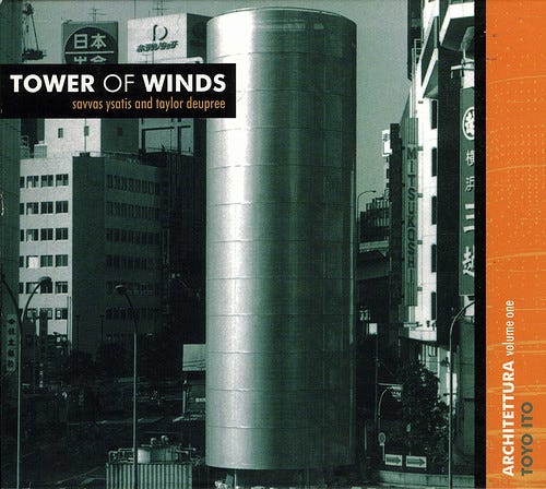
I came upon this quote in 1999, in the liner notes accompanying a CD, Savvas Ysatis and Taylor Deupree's Tower of Winds. The Tower of Winds is a Toyo Ito structure, depicted on the album's cover art:

The little sidebar on the right there indicates that this album is Volume One in a series called "Architettura," a series devoted to "exploring the synergy between the man-made worlds of architecture and electronic music." There were ultimately four releases in this series--this one, Tetsu Inoue's Waterloo Terminal, Panacea's Brasília, and David Toop's Museum of Fruit. Pretty cool! (Toop's book Ocean of Sound, by the way, is probably the best book ever written about ambient music and its theoretical underpinnings).
Looking back on it, this project carries with it an undeniable "late 1990s" feel: the spheres of "cerebral electronic music" and "postmodern architecture" and "critical theory" really seemed to all line up right around then and I feel like they've never quite found as harmonic a convergence again. Maybe that's not quite fair: after all, postmodern architecture and critical theory seem to be still enjoying a happy cross-pollination--look no further than architect Mark Foster Gage's proposal for a 1,492-foot gargoyle-laden residential tower informed by his interest in recent trends in philosophy.
Is it just electronic music that dropped out of this alliance? It's undeniably harder to pull off "music as theory"-type projects now that music circulates mostly digitally--with physical sales accounting now accounting for only 9% of music industry revenues, the idea of liner notes is effectively dead, so artists no longer have an easy way to bundle their work with a conceptual scaffolding. It makes me feel a little wistful, honestly: I miss projects like that! The last Architettura volume was released in 2000 (looks like its parent label, Caipirinha Productions, folded that year). Taylor Deupree, one of the two Tower of Winds performers, is still around, though: his label, 12k, has been going strong for over two decades now, and he still releases his own work regularly: I in fact just bought a new release of his on the same day that I began writing this (May 1, the second "Bandcamp Friday"). Happily, it even utilizes a conceptual scaffolding, which you can check out in the writing in the sidebar of the release's Bandcamp page.
Anyway, what I really wanted to talk about here was the Tower. On the album art it doesn't look like much, just a grey shaft. (Its actual function is to serve as part of the air conditioning infrastructure for an underground Yokohama mall.) But inside there are "over 1,000 lamps, twelve neon rings, and thirty flood lights" (according to this Architettul write-up), which allows the Tower to take on a staggering range of different appearances:


That's pretty neat, but even cooler is that the Tower is responsive: those lighting displays are reacting to measurements of wind and noise levels, making the Tower itself a kind of elaborate data readout. It's adjacent to what we'd nowadays call networked art, though interestingly all its data is gathered locally--it doesn't require a network in order to function.
The Tower of Winds was completed in 1986, and I don't think it's wrong to say it was prophetic of things to come. Interest in responsive, sensor-laden architecture is higher than ever--it's become one critical piece of the "smart city" concept (still pretty nebulous, this concept, although some people estimate that spending on "smart urban services" has reached around $400 billion per year). Things like responsive lighting to have even trickled down to the consumer market: you can go to Best Buy and get a Hue lightbulb, and if you want it to turn blue when it starts to rain outside, it's just a matter of clicking this button. But this was pretty new terrain for 1987, when Ito's techniques were not adopted widely by either urbanists or by artists.
At least not as far as I could tell in my investigations, anyway. I did get my big Information Arts anthology down off the shelf--it was published fifteen years later, in 2002--and I poked around in it a bit, looking for projects akin to Ito's: I found three pages on "Kinetics and Light Sculpture," three pages on "Information Visualization," and three pages on art using "Readings of the Physical World," but I couldn't really find any projects where an artist moved between these distinct areas in interesting ways. This puts Ito comfortably ahead of his time, though at least he got some (niche) recognition: the Tower won him an Edwin Guth Award of Excellence in '87 from the Illuminating Engineering Society, "the recognized technical and educational authority on illumination" since 1906. (They currently have a legitimately interesting FAQ page up about germicidal UV, since that's, uh, been in the news lately.)
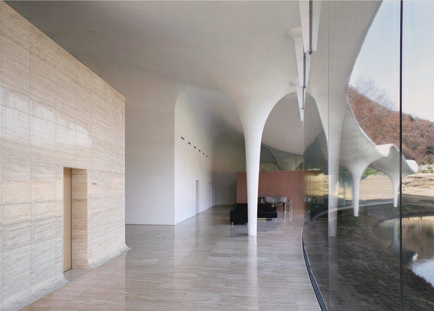
I remain intrigued by (and a little critical of) Ito's desire to make architecture "like an unstable flowing body." You could certainly say that a project like the Tower of Winds draws inspiration from the biological (its flickering skin brings cephalopod chromatophores to mind), and more recent Ito projects like the Meiso no Mori Municipal Funeral Hall (2006) possess an undulating, biomorphic quality that is simply stunning:

But I think I was attracted to the idea of an "unstable" architecture because of its adjacency to Situationist architectural provocations. I read Simon Sadler's The Situationist City around the same time as I first got interested in Ito, and one can pretty easily draw a trajectory between Ito's ideas and something like proto-Situationist Ivan Chtcheglov's "Formula for a New City," published in 1953. Chtcheglov writes that he wants buildings that provide "a minimum of comfort and security," but he also wants an architecture that is "modifiable": "Its aspect will change totally or partially in accordance with the will of its inhabitants[.]" If that sounds like it could possibly create some confusion, rest assured that Chtcheglov considers that part of the point: "The changing of landscapes from one hour to the next will result in complete disorientation," he writes, triumphantly. A building that truly works like an "unstable flowing body" would probably fit in perfectly well here.
It's worth taking a look at just how far out Chtcheglov's writing gets, and just how ridiculous/sublime his ideas become. He encourages cities to develop a "Sinister Quarter," which "would be difficult to get into, with a hideous decor (piercing whistles, alarm bells, sirens wailing intermittently, grotesque sculptures, power-driven mobiles [...]), and as poorly lit at night as it is blindingly lit during the day by an intensive use of reflection. At the centre, the 'Square of the Appalling Mobile.' [...] [A]s they explored the Sinister Quarter, the child and the adult would learn not to fear the anguishing occasions of life, but to be amused by them." Sounds like a great place to visit, but you probably wouldn't want to live there--and one wonders whether you'd want to live in a building which the architect set out to design as deliberately "unstable." (For what it's worth, Chtcheglov was eventually confined to an insane asylum in 1959, after stealing dynamite from a construction site and boasting that he was going to blow up the Eiffel Tower.)
Ito's story, though, takes a happier trajectory: he's kept working, and his level of recognition has only grown: in 2013 he won the Pritzker Prize, considered the "Nobel Prize of architecture"--it puts him in the company of global superstar architects like Frank Gehry, Rem Koolhaas, and Robert Venturi. Phaidon has put out a nice-looking retrospective of his work.
-JPB // Dedham, MA, May 1-4, 2020 (revised Wednesday, May 6)


